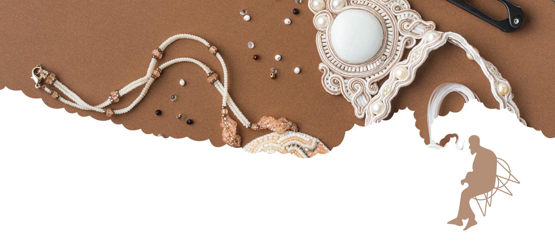
Their commitment is to excite every jewelry lover with variety of designs. Their products are custom made according to the likes of their consumers ideas, material & color choices. Prioritizing quality, they aim to satisfy their customers until they keep coming back to them, proving that handmade jewelry can be economical as well.
Regal welcomes you to a unique world of handcrafted jewelry, where elegance meets luxury lifestyle choices.
About Regal
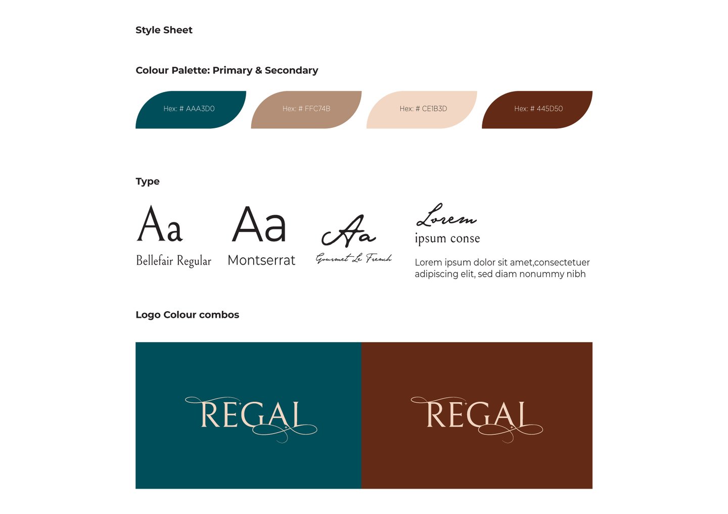
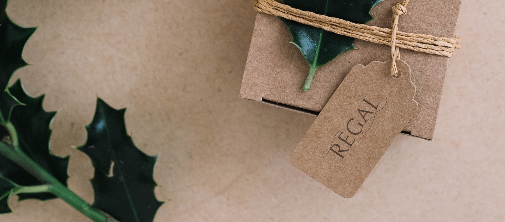
Logo: The logo features a word mark which symbolizes the free & handcrafted essence of the brand . The star & thin lines conveys the intercity of the brand.
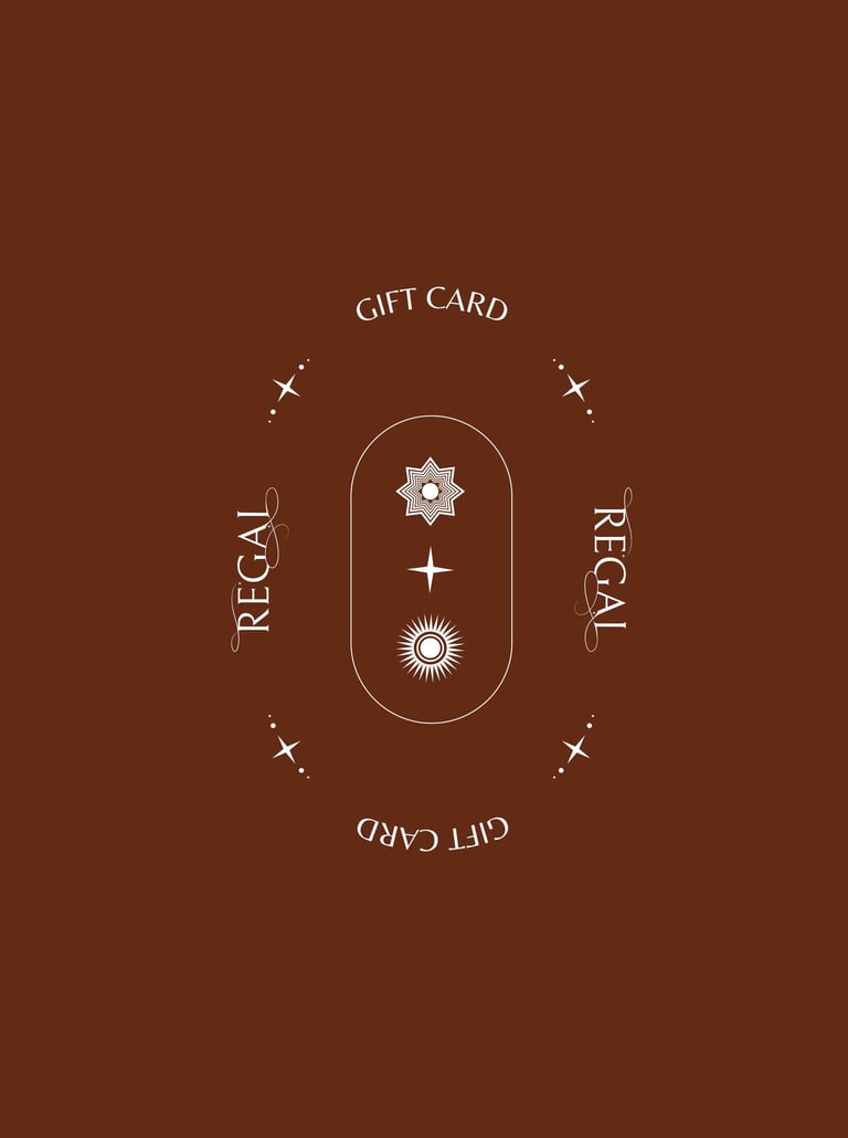
Color Palette: Inspired by royal themed colors, it incorporates elegant tones such as deep blue & red, beige & cream. These hues evoke a sense of tranquility. The choice of these colors ensures a luxurious experience.
Typography: The selected fonts balance modernity and approachability. The primary font is serif style which adds a touch of personal connection, while the secondary font is a clean feel.
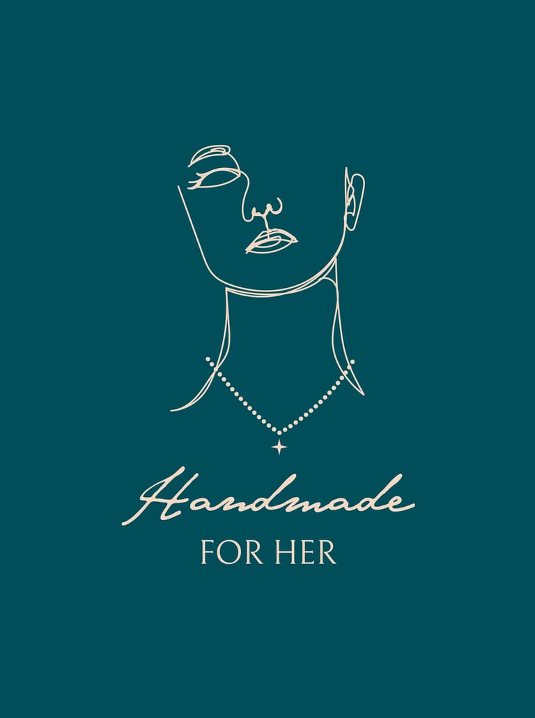
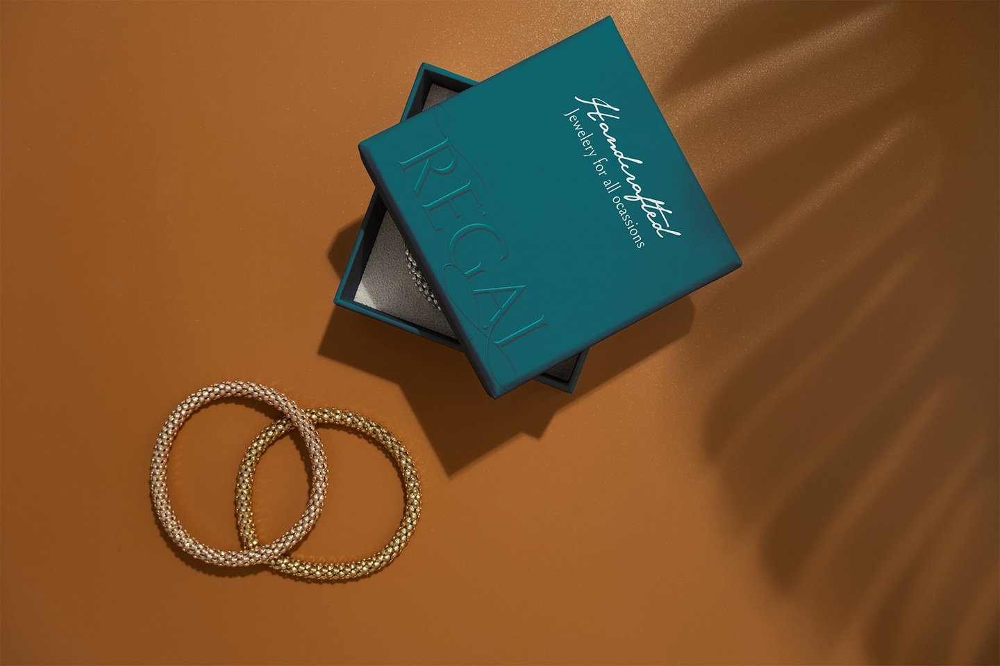
Imagery: High-quality visuals showcase the jewelry wearing & gifting experience.
Conclusion: The brand design strategy was to create a cohesive and inviting identity for Regal handcrafted jewelery. By combining luxury and royal colors. This strategic approach seeks to resonate with consumers seeking a balance between modern jewelry and the time-honored tradition jewelry aesthetics.
About the Project
