Their commitment is to delight every customer with a variety of choices, keeping affordability and quality in mind, their app is a one stop destination fulfilling their daily necessities or craving for gourmet imports. Prioritizing good service they aim to satisfy all their customers with rapid delivery without product damages proving that zapper is a pocket lover!
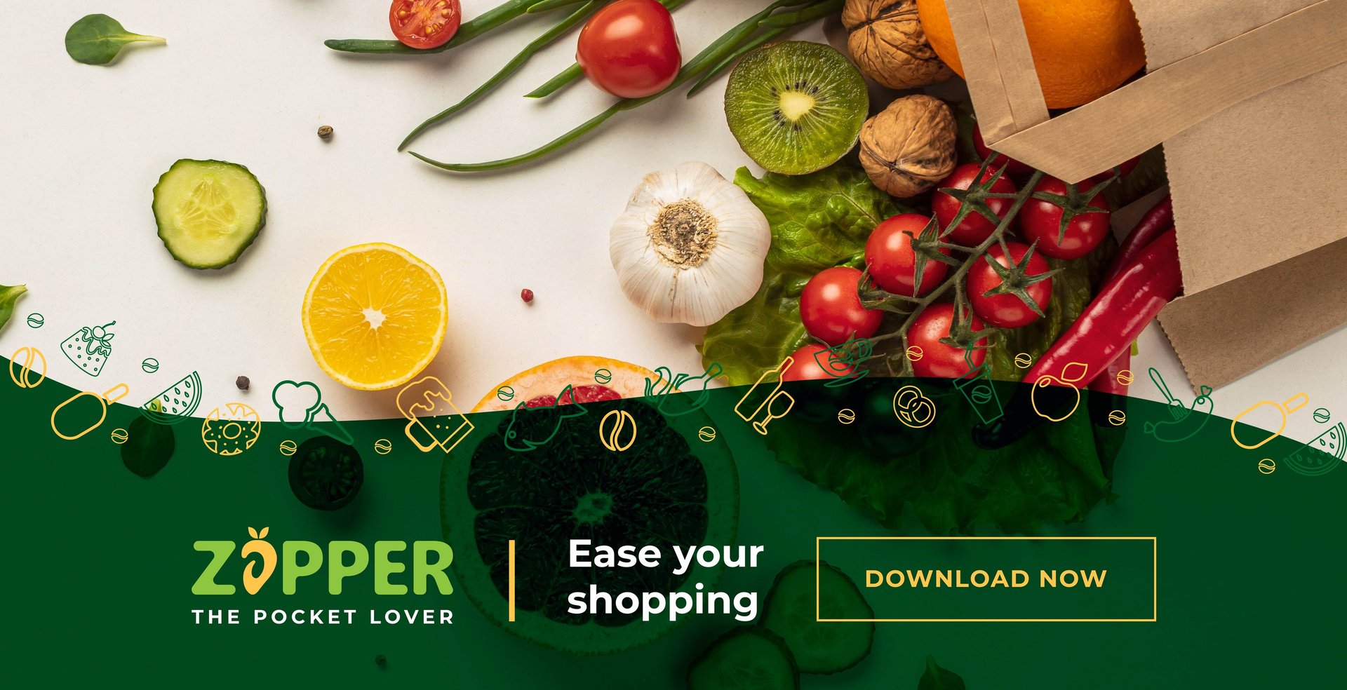
Zapper welcomes you to a place where affordability meets variety along with good quality service.
About Zapper
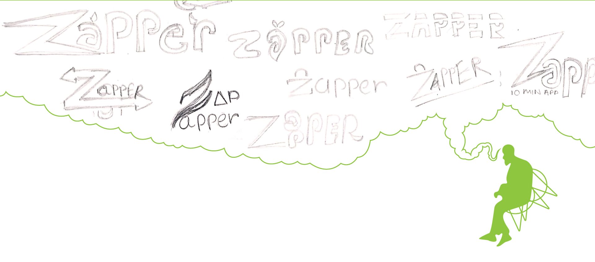
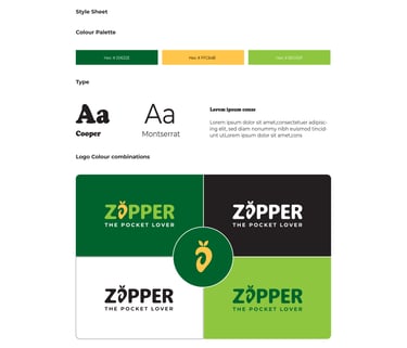
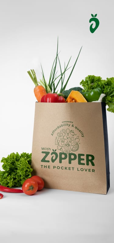
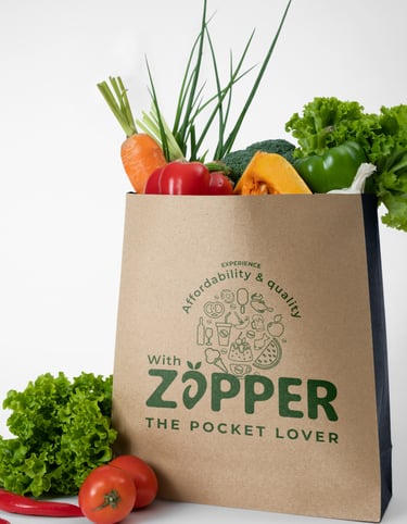
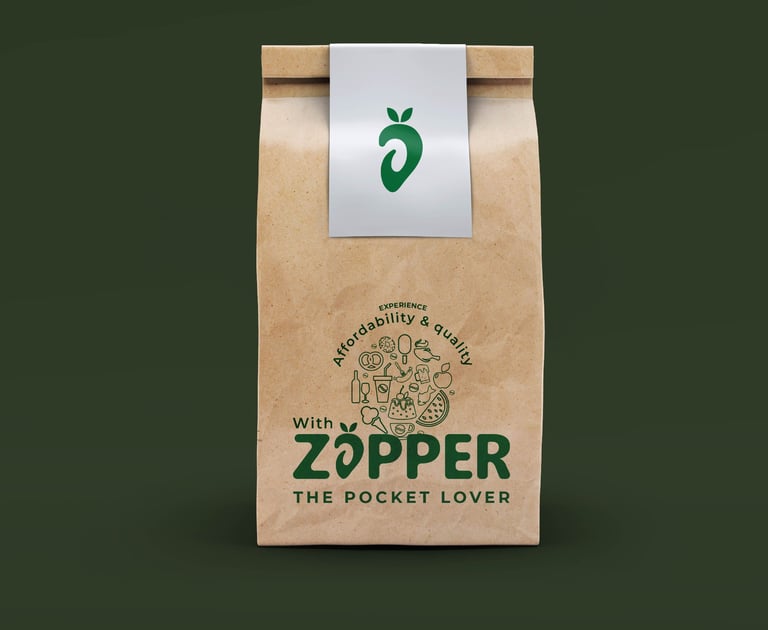
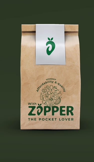
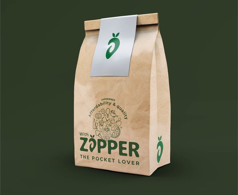
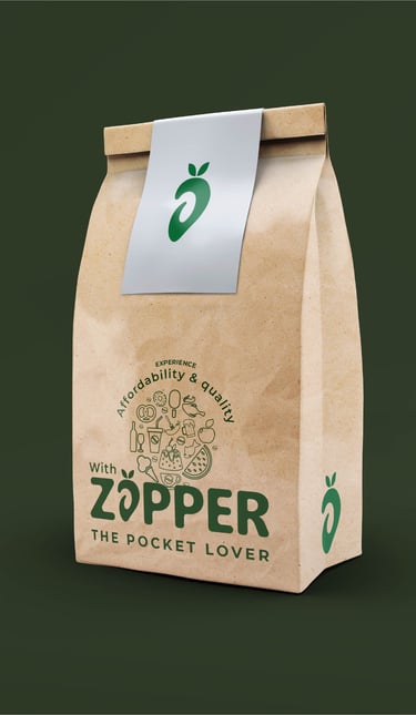
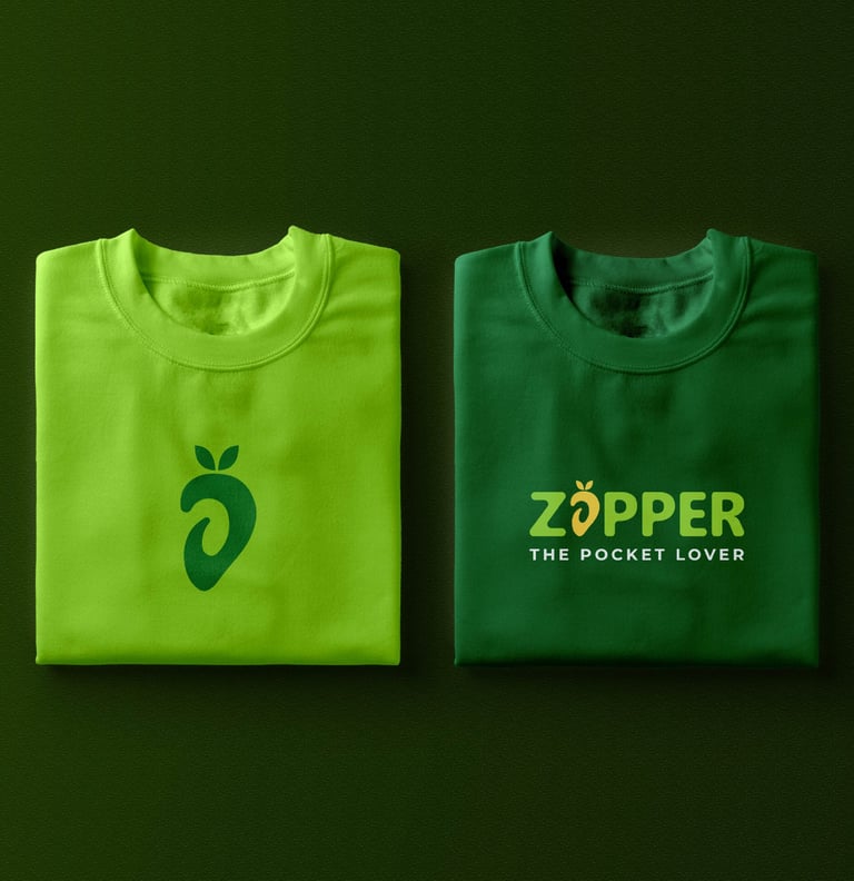
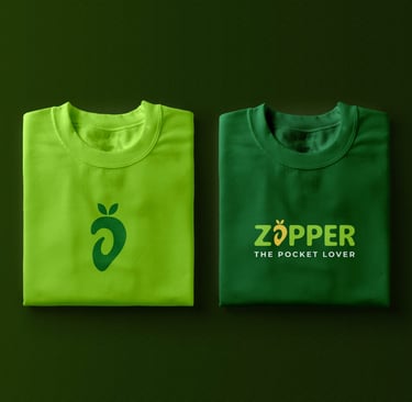
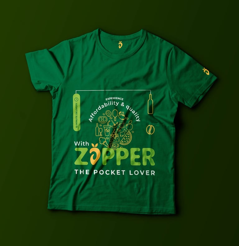
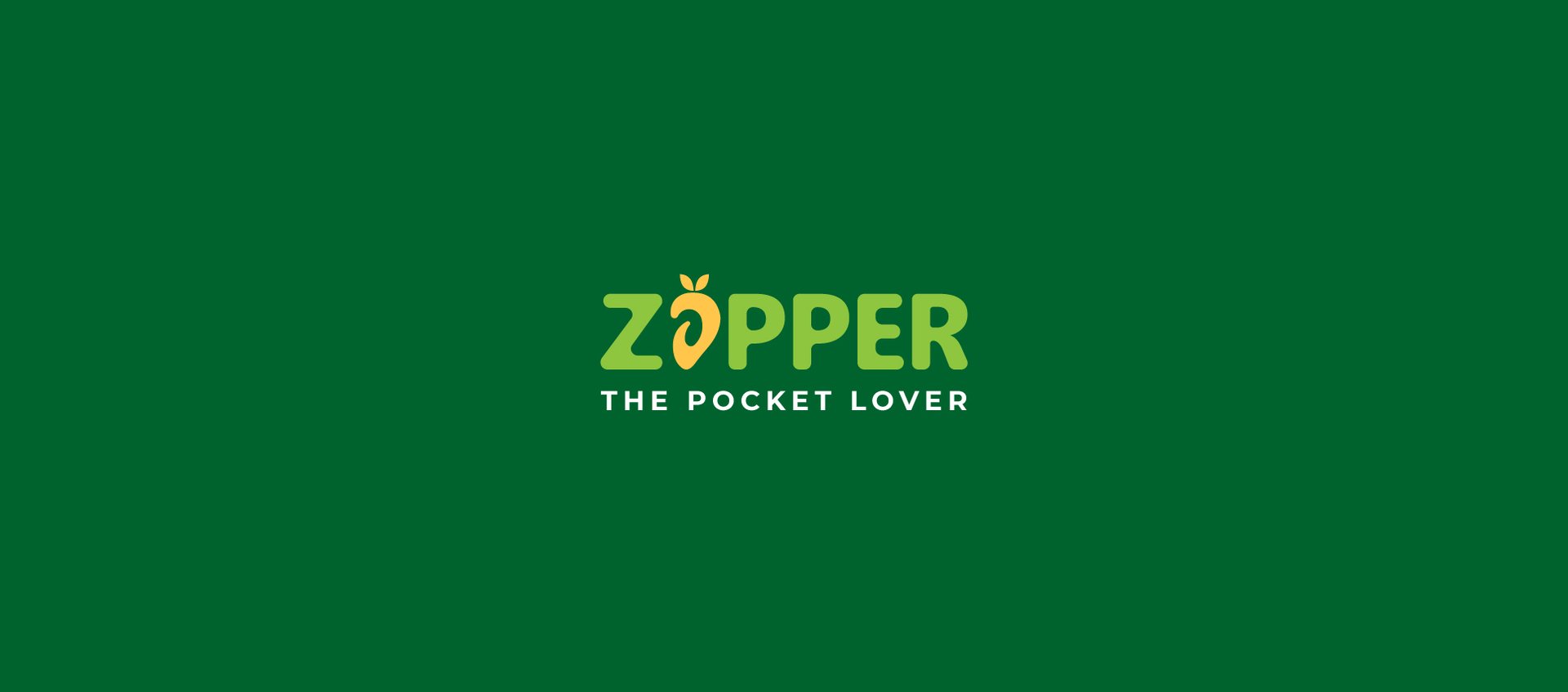
Logo: The logo features a combination of our national fruit, Mango & the letter “A” placed together with the brand name “zapper”, it symbolizes the unity of all different grocery items India and the brand has to offer . The natural color of mango conveys a comforting feeling of freshness & ripening.
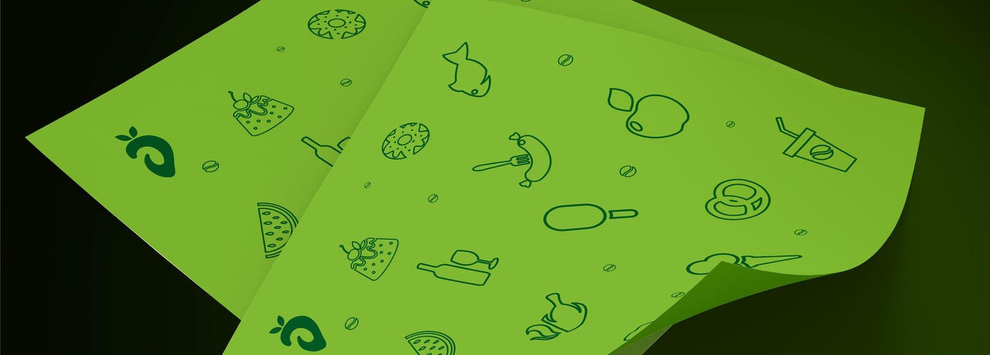
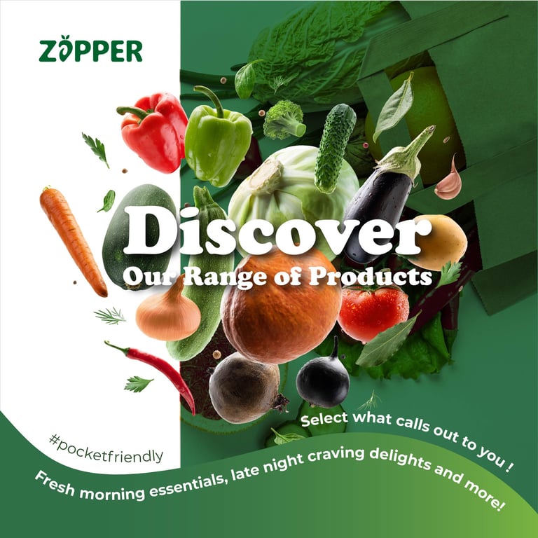
Color Palette: Inspired by nature, the color palette incorporates fresh tones such as green and yellow. These hues evoke a sense of trust and align with the fresh aspects of the brand. The choice of these colors ensures a comforting visual experience, reinforcing the brand's commitment to good service.
Typography: The selected fonts balance modernity and approachability. The primary type-phase is a serif style which adds a touch of personal connection, while the secondary type is a clean feel.
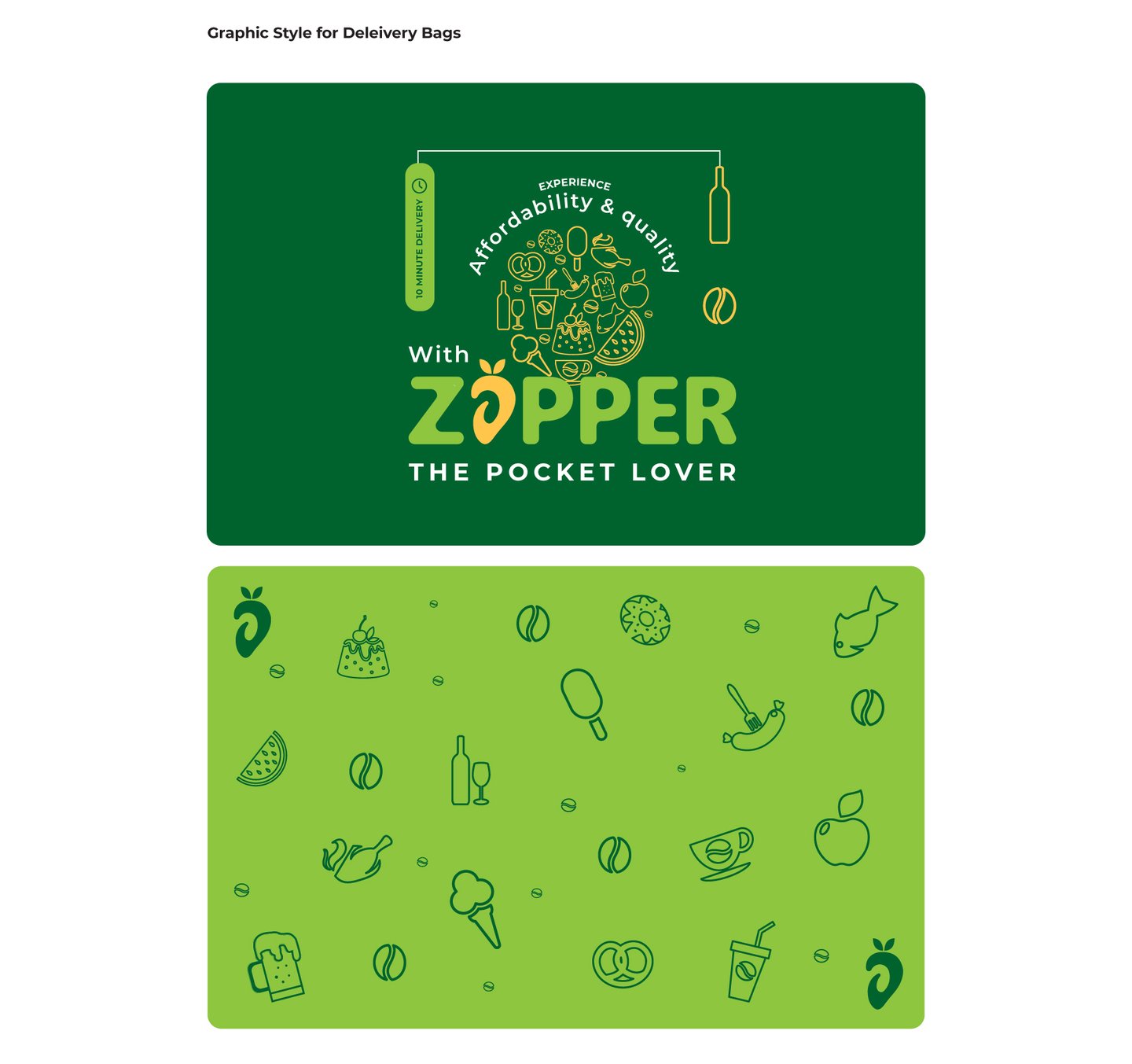
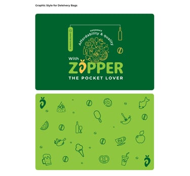
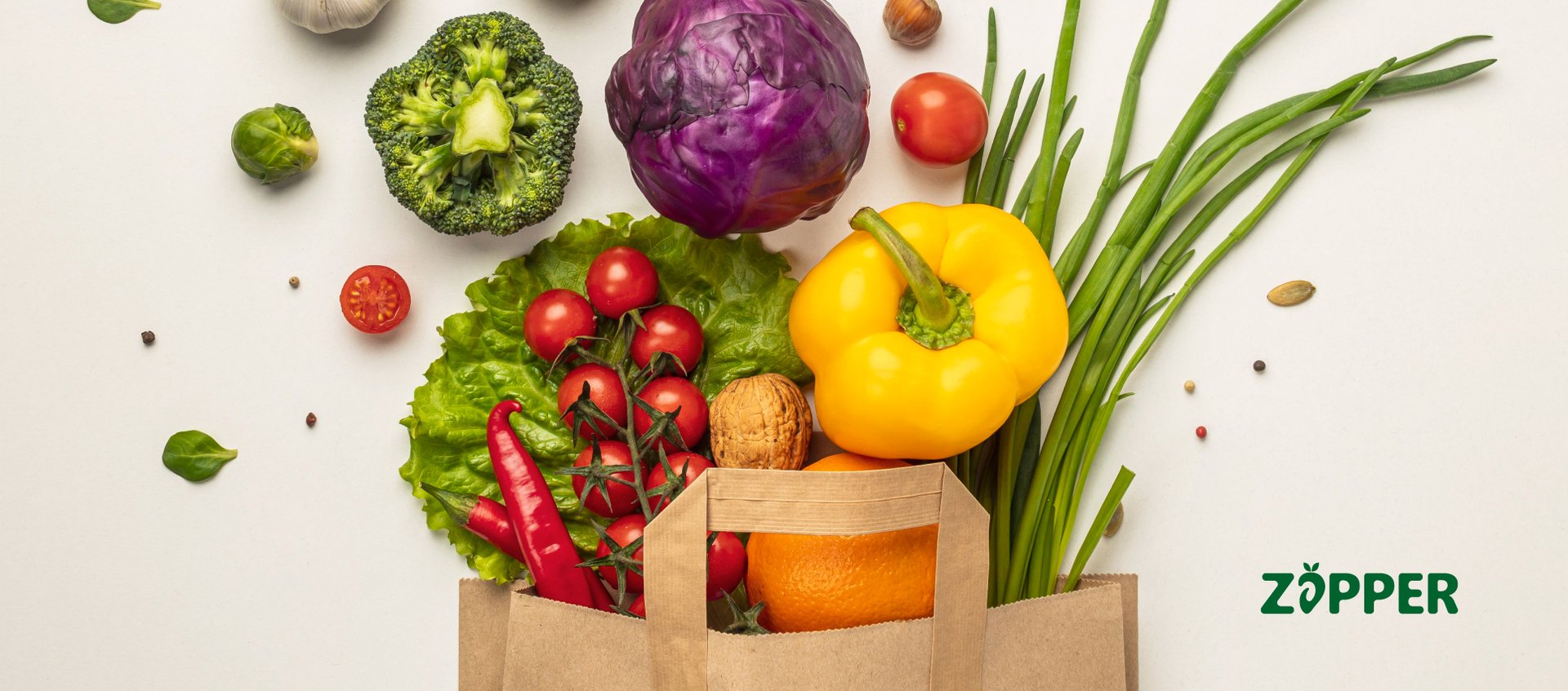
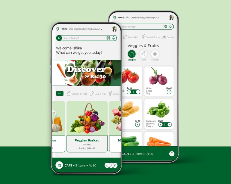
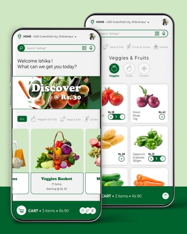
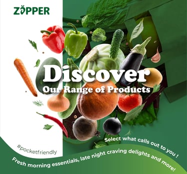
Imagery: High-quality visuals showcase the food delivery experience, with images of fresh fruits & vegetables.
Conclusion: The brand design strategy was to create a cohesive and inviting identity for Zapper. By combining nature-inspired visuals, comforting colors, and mindful messaging, the brand communicates its commitment to providing a budget friendly experience. This strategic approach seeks to resonate with consumers seeking a variety of goods to be found all in one place.
About the Project